
Bold enough to be bad
- Jessa Parette

- Aug 13, 2020
- 3 min read
Updated: Aug 14, 2020

Early in my design years, I read an article that talked about becoming a better designer by imitating great designs. By intentionally trying to re-create an amazing poster, interface or photograph, you could train yourself to see how the professionals think, what they did to balance color, space and imagery, and the discipline required to notice these details.
So, I decided to try this tutorial from Brazilian designer Breno Bitencourt to create a low-poly portrait. Quarantine was in full swing, and the weekends needed to be filled with something creative and easy, I figured.
Attempt 1: I underestimated the challenge
To practice, I picked a photo of my brother. The tutorial has two distinct steps: Creating the shapes in Photoshop first, and then exporting the image and using the pen tool in Illustrator.
I'll spare you the details, but after 10 hours, this was the result.


In case you didn't enlarge the photos, let me just tell you: It was so bad.
In the first attempt, I followed the artist’s instructions of going to photoshop first to outline the basic geometric shapes as a layer, and then exporting it as a flattened image into Illustrator to recreate them. The re-tracing practice created gaps between the shapes, and it wasn't until I removed the back layer that I saw the alignment issues.
Note: I was so frustrated with how badly this turned out that I deleted the original files, which is why I only have screen captures. 🙄
Attempt 2: Making it my own
A few weekends later, I was once again itching to try something new, bored with quarantine and inspired by a solid playlist of The Killer's best hits. Armed with 20 hours of practice, I pulled up the tutorial again.
In the first attempt, I found out that tracing the image first in Photoshop created gaps when I put it into Illustrator. Second time around, I figured I could create the same look and align the sides immediately if I just created the shapes directly in Illustrator and skipped the first step.
Design progress:


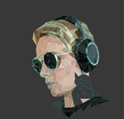


Doing this also cut the time required to create the initial shapes in half. What did end up happening was detail almost too much to create the variance I wanted among the shapes. Final result: A much more detailed profile image.

Aside from the time savings, I reflected on differences between the two rounds of practice.
Don't be afraid to suck
First, I realized that the second time I felt bold enough to break the rules because I knew what I wanted and had practice enough to know what to cut. In learning, this is a sign of slowly mastering a skill. The best writers (like my personal favorite Cormac McCarthy) have mastered the rules of grammar and syntax, and thus know how to break the rules without breaking everything.
Learning the foundations of design (color theory, typography, information architecture, software etc) and practicing what is uncomfortable is not about having an academic checkmark, but arming yourself with the freedom of choice.
Second, practice doesn't make perfect, perfect practice makes perfect. Bad habits, like when I failed to name my layers or didn't close paths, came back to bite. Seeing the disorganized method from my first attempt highlighted the small disciplines threw cold water on my 'progress'.
Third, celebrate when you suck. Learning a new skill, or deepening your expertise in any area, requires courage to not be good at something (at least for a while).
When I first started swing dancing (yes, I can swing dance), my instructor told me something that stuck with me: "You'll never be a better dancer if you don't dance with someone better than you."
In a world of perfectly polished portfolios and imposter syndrome at every corner, embracing awkward imperfection is freeing. Be bold enough to be bad, because that's how you get better.

Comments